GEN OTSUBO
Leap Motion, Inc. (Ultraleap) is a world-leading company of a contactless computer interface technology. They produce highly precise hand controllers and opensource AR headsets.
I joined Leap Motion as a senior UX designer, between October 2017 and March 2018. I was a launch member of the London design team led by an AR specialist Keiichi Matsuda. I collaborated with the marketers and engineers in the US/Canada, visual and concept designers in the UK. I was involved in the following projects:
My responsibilities include the following tasks:
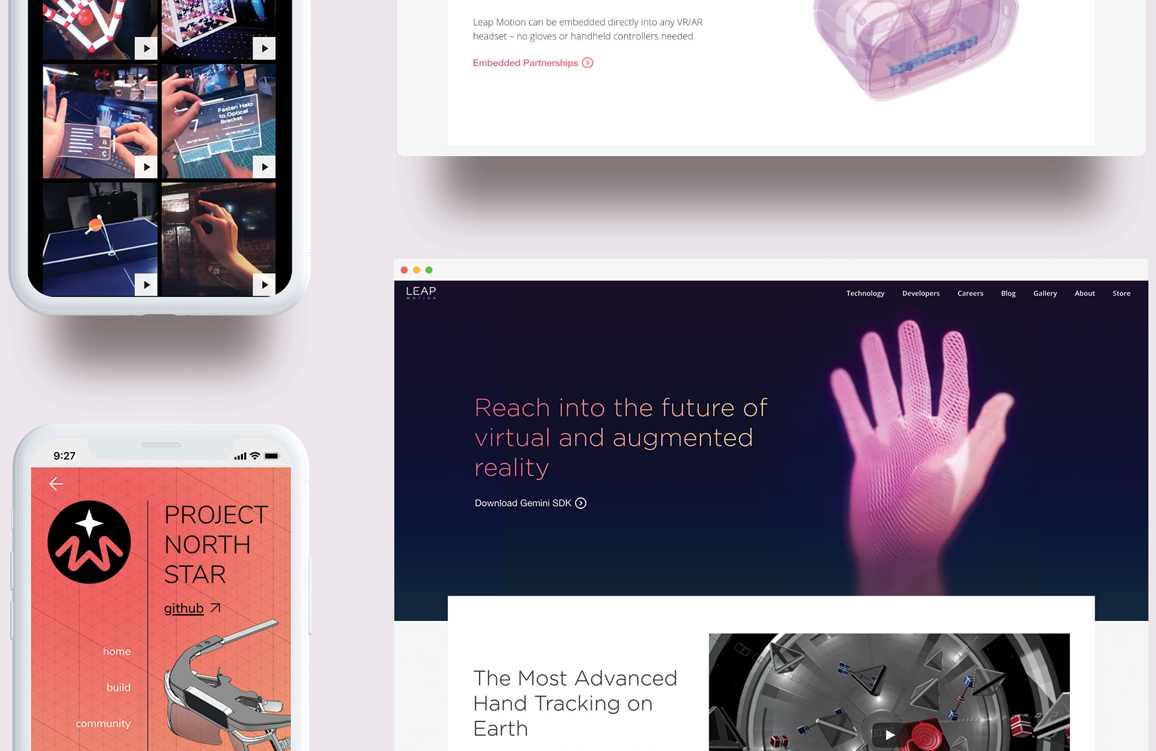
The consumer site was the most significant online service the company run. It sells hundreds of controllers every day through this site. Hundreds of thousands of developers access every month.
I proposed the stakeholders to refurbish the consumer site experience to maximise the benefit for both users and the company.

I started the project by asking people outside the company, to explore the existing site and find ways through to specific contents on the site.


I also interviewed the director of the online community in depth, to figure out the intentions of the current design. I discovered several issues on the user experience.
I immediately realised, many testers took a long time to figure out what our products offer. The information on the site was technologically focused. We talk a lot about the specifications of the software and the hardware, but the experience and the story was not explicit to new visitors.
I tried to overcome this problem by filling the site with videos showing the experience achieved with our product.
The idea came from the personal experience of struggling to explain what the company does to people, except by showing related videos.
I collaborated with Unity developers to make short clips of looping animations. The animations are clips from the VR apps other designers and engineers have been creating.
It resulted in more users successfully managing to explain the product accurately, in a later test with new users.
The next common feedback was about two products we list on the site. They used the same technology inside and were explained on the same page.

Left: A product for any developers—a VR developer kit, to attach on their VR headsets.
Right: A product for manufacturers—a stripped-out version to embed into any upcoming headsets.
The first thing I did was to update the product image.
A catch copy of the product made for the manufacturer is
"Absurdly small". It is so small that most people do not notice in the image.

The highlighted component is the product.
I directed a designer to produce a short animation for making our product more noticeable in the image.
This clarified the component is embedded into a head mount display.
The second thing I did to differentiate the two products was to redesign the information architecture.
When it comes to optimising the user experience, the difference in the target users makes the most considerable difference to the design.
I advised the stakeholders to describe each product separately, as they are made for different target users. I failed to convey this message at first. One stakeholder had a strong passion for the underlining technology, so much that, he insisted on explaining the technology in the same context.
I created Customer Journey Maps for each user type to explain the importance of separately planing the information structure.


Customer Journey Maps helped me to be more explicit with my idea. It also led to more active communication. The stakeholder showed understandings towards the user-centric design. At the same time, I became more enthusiastic about explaining the technology in right context.
I also used these Customer Journey Maps to reconfigure the menu structure.

The menu is structured, so the further down into the menu, the more dedicated the target user becomes, from tech enthusiasts, developer to the enterprises.

The design concepts were coming together. I needed to test the new design before updating the site accessed by developers from 50+ countries daily
I had a mission to create a lean version of the site for the Chinese server. I decided to implement the new design on the China site first, test it, then update the global consumer site.


The conversion rate for the store arrival and SDK download was higher than the original site. I cannot directly compare the results as targeted users were different, but this was positive information for implementing this design onto the global site.
I used mixpanel to carry out further iterations of design. Refining the link positions and wordings.

After several design iterations, I implemented the design to the global site.


I also worked on creating a portal site for the new product. Project North Star is an opensource xR headset. It is made of 3D printable parts and commercially available electrical components. The headset is buildable under $100, aiming to democratise the power of xR.

We already released the beta version of the software on GitHub, with documentations and printable 3D data. However, all other information and news are scattered around the internet.
We needed a place to fannel users to access all files, instructions and news for the official product release.
The first request from the marketing team was to build a community site with forums, news and all downloadable contents.
I presented the stakeholders to make a portal site instead, where we link all existing web services together.

This way we can release the site within the limited time frame we had. Also we can avoid updating data in multiple servers, and keep all conversations in one place without making users sign up to another account. This makes maintaining the project much easier too.
I collaborated with the VP of design in London for visual branding. This was the first opensource project in the company, and we wanted to disassociate with our commercial products.
The targeted users were very niche tech enthusiasts. We went for the technical and underground look. We researched other companies in the field and differentiated our branding to be something new and cutting-edge.


The work environment was extremely high-paced. The core business strategies shift every month or sometimes in 2 weeks. There was a high demand for quickly producing deliverables, move onto the next project. I also commonly experienced sudden holds on the releases.
It was a challenging situation to plan, make and iterate the design carefully. Core stakeholders had different views on the goal or the approach. I have learnt to cope with these stresses and keep finding the best solutions for situations in front of you.
I believed in extreme simplicity and utility - minimise the cognitive load, make the next action most accessible, know what your users know and lead them the shortest distance to intended actions. The beauty will follow if all functions are lean and logical.
In a way, I still believe that. However, I also learned that the enthusiasm of users comes from the individuality and novelty of the service.
I realised by working with people who are serious about creating a future no one has ever seen. Logic makes everything smoother, but to move people's emotions and create new things beyond imaginations, we must rely on the imperfection. Rules are powerful, but at the same time, I need to be conscious it is limiting the possibilities.